I have been to the Francis Bacon and the Masters exhibition at the
Sainsbury Centre for Visual Arts in Norwich.

Comparisons were able to be made between Bacon's work and the inspirational work by those he admired. How disappointing then that Velasquez work, Pope Innocent X was conspicuous by its absence. It is what I went to see! Given the premise, it is the one you think of! Oh dear not a good start.
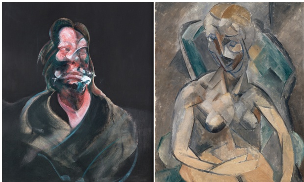
In the main, I have to say that Bacon suffered by the comparisons. I.E. Colour choices by Picasso were far brighter, vibrant, which sorry to say is not evident in these reproductions garnered from the internet.

 cc
cc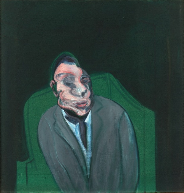
Most folk I have spoken to say there is NO comparison, that Bacon pales into insignificance. And before I saw the exhibition I would have agreed. I dislike Bacons tendency to plaster on the paint, and that is a personal preference, but I can see the inspiration and sometimes what he was trying to do and have admiration for that. In this instance I prefer the Bacon to the Matisse! There is more movement, expression, solidity and the look on his face begs so many questions.

I would have this on my wall if I had one big enough!

And, although the subject, the bull fight, is not pleasant, I like this tryptich, the colours, the format, the feeling of it.

And Roy's pick of the day.........this Van Gogh Farms Near Auvers
I agree this is very nice, I could live with this, and I had not been aware of it until today.
My opinion of Francis Bacon has changed because of this exhibition, I like his ideas, if not the execution of those ideas. I now have ideas of my own..............watch this space.
I would recommend this, you really have to make up your own mind.
2 comments:
Thanks so much for posting this, I think I agree with your views, indeed!
I like Bacon's distortions better than Picasso's. Bacon's have more motion/emotion. Great exhibit. Great post..Our museum has several Bacon's my favorite is his boxers. You feel the punches. :-))
Post a Comment